Our entry has definitely been through the ringer and evolved over the years. It's taken a LONG time for me to be happy with it, but I think I'm finally there....


The entry is basically just a long wall to the right of our front door. There is no alcove or anything structurally that helps define the space, so I was really starting from square one. Feast your eyes on this beautiful picture of the long wall for your reference:

We are usually on a limited budget, so for a while I had to work with what I had- including a gigantic and not so attractive dresser.
A few years ago, I used a skirted DIY approach to lighten up and cover an old dresser that was acting as our entry table. It definitely helped the situation because it finally gave me something to put my keys (and junk) on- but the dresser was too long and I was never in love with the coverup situation. I tried to get on the fabric skirt train, but it was always a source of sore eyes for me.

Since the dresser was too long, I had a hard time finding something on the wall to balance it out. I tried so many different things including this Cozamia print above (which I still love) but it didn't work in the space and I felt like it was dictating all of my design decisions in the surrounding rooms. The print is now in the guest room where it is a much better fit (even though that room has been abandoned for quite a while… ,At this point, I'm just holding out until it needs to become Max's big boy room.)
I tried all different kinds of things before deciding on the direction I wanted to go. I got out some of my old art sketches that I did in college, but I only hung four which just never looked right. It didn't occur to me for some time that it was very off balance- two more prints (a total of 6) would have worked much better. Duh. I also tried some mirrors and some sort of grid lattice DIY situation- but it wasn't working. Keep in mind this was like 2 years of throwing ideas out there.
Here are some of the ideas that DID. NOT. WORK...


Wut?

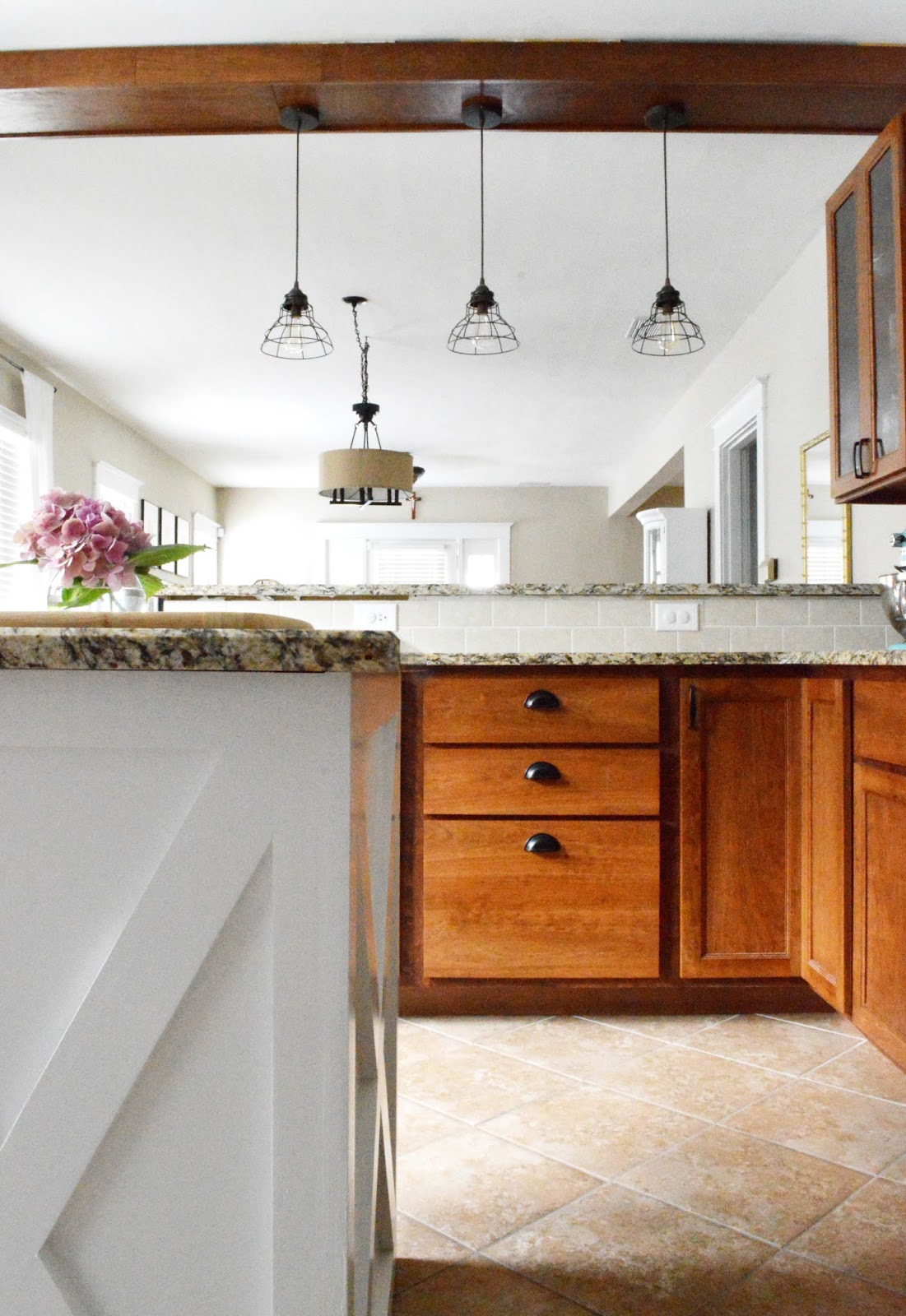
We eventually donated the dresser because I was wanting something different and it gave me the perfect excuse for new furniture. I also gifted Nathan a new saw for Christmas, so this was obviously going to be the first project. I sketched up some ideas for an entry table and was also inspired by this Ana White console table; however I ended up taking some design liberty and editing. Removing the four end posts made it more stream-lined and simple. Since the table needed to be fairly narrow, I didn’t want it to be bulky and I thought this was the best solution. I also love the classic X shape (like on our mobile island) so I wanted to repeat that pattern within another piece of furnishing.
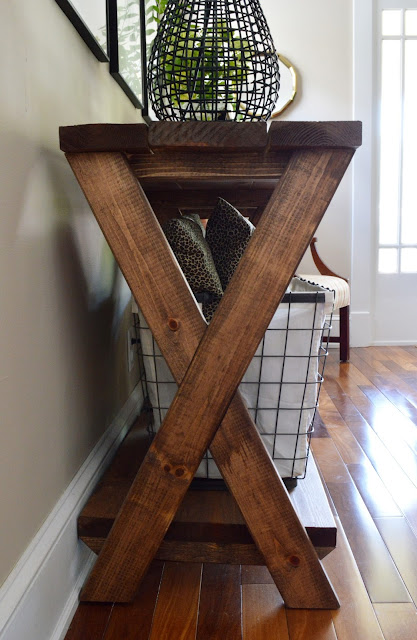


We decided on the Minwax Special Walnut stain- it's not too red or dark. Dana from HouseTweaking uses this on a lot of her furniture, and I've been keeping that in my mental folder for a while now. I thought about painting it white, but figured it wouldn't hurt to stain first since you can't really go back after painting. Not surprisingly, I really love the stain and doubt I will end up painting it.

Now that the table was better proportioned and not crazy long like the dresser, I was able to focus on items to hang on the wall. I eventually found some great and FREE prints that I was able to frame. I found the link off of Apartment Therapy and I love the look. They are a bit more modern than standard botanical prints- but still have the classic look. You will notice that I hung six (instead of four like I did with my art prints a year prior). Hanging six really helped balance everything out- it looked sooo bare now that I look back. Sometimes it just takes a while and lots of trial and error for something to click. I think that can be a big design mistake- by either not hanging enough or by hanging too small of frames. I have obviously done both in my day.


In the future, I may switch out the prints for a big mirror but I have yet to find a mirror that has been big or interesting enough- and in my price range. I think a mirror will brighten up the space and be practical as I'm heading out the door, but for now I'm really liking the prints. By going with larger frames and hanging them high, I think it makes the walls look taller than what they actually are- and the white mats are a great compliment to the darker wood.

Here's a cheapo solution: If your artwork is not expensive or you are just framing prints- you can easily cut out mats from posterboard with an x-acto knife. I do it ALL THE TIME because I'm not willing to spend money on expensive mats from the framing store. I will only buy an acid free, custom mat if I have something that is more valuable and I want it to keep for a while. Also, these frames are the very inexpensive kind from Hobby Lobby- the ones I would usually pass up in the aisle because they looked dinky and cheap.
Another note: When in doubt- go larger with your frames. It usually never fails.


Here's a cheapo solution: If your artwork is not expensive or you are just framing prints- you can easily cut out mats from posterboard with an x-acto knife. I do it ALL THE TIME because I'm not willing to spend money on expensive mats from the framing store. I will only buy an acid free, custom mat if I have something that is more valuable and I want it to keep for a while. Also, these frames are the very inexpensive kind from Hobby Lobby- the ones I would usually pass up in the aisle because they looked dinky and cheap.
Another note: When in doubt- go larger with your frames. It usually never fails.


I finished styling with a black lamp from World Market and baskets from HomeGoods- and of course a tray, a collection of books, and picture frames.

FYI- This greenery is FAKE. I'm not above it.


This greenery, however, is real- but was clipped out of the brush on the side of my house. Free décor for everyone.


This space was a toughie for me (and I'm not even sure if its done). I would love to flank It with two chairs, but I cant justify spending $$ on that at the moment. This just goes to show that you may have to live with a space for a while- and go through some trial and error- before you can achieve the look you want. I wasn't happy with it for YEARS, but I'm now loving that this is the first thing you see when you walk into our home.